|
Graphing is enormously important to the world of science and math (not to mention standardized testing like the ACT). Before using Excel as a tool to help us analyze data and model our natural world, it is useful to practice with the tool on its own first. This lesson is a tutorial on using excel for graphical analysis of data and creation of mathematical models. Note: In this tutorial, I am focusing on using these files on Excel's iPad App but the materials and structure of the lesson will work just as well on a computer :) Structure of the LessonTo maximize our time practicing graphing skills, I put together a file where the structure, formatting and data is already done so the students are only required to use the graphing tools to visualize and create models. Each worksheet is in its own tab along the bottom of the file and is intended to walk students through the entire process of graphing with Excel. In my classroom, I typically use the first few tabs as a full class tutorial and allow them to complete the rest on their own while I circulate the room. Below is a list of the tasks and skills introduced for each of the worksheets:
Graphing Worksheet - Printout
Warm UpBefore starting on the graphing portion of the lesson, the first tab is meant as a warm up to review and practice the basic excel formula work that was presented in the previous lesson. This warm up covers the following topics:
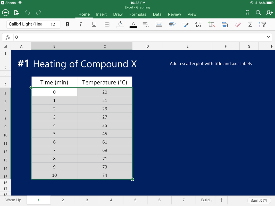
This can be presented as a full-class guided practice, group work, or individual warm up depending on the students' comfort level. For more information on these topics, see the lesson plan write up for Solving with Formulas 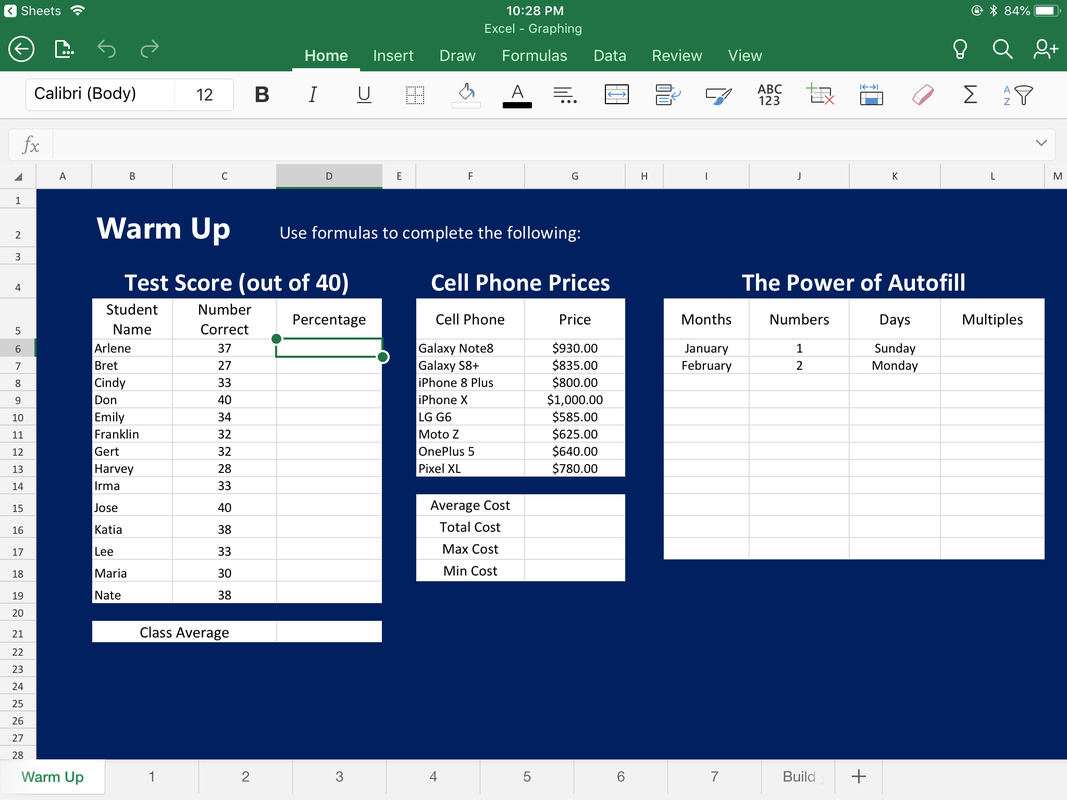 #1 - Heating of Compound XAdd a scatterplot with title and axis labels 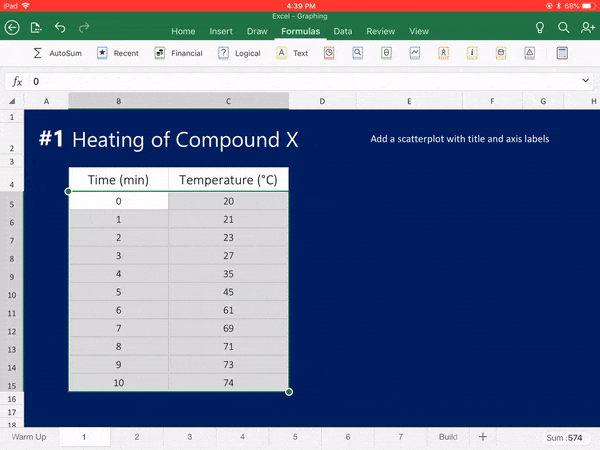
#2 - Car Value by YearAdd a scatterplot with title and axis labels 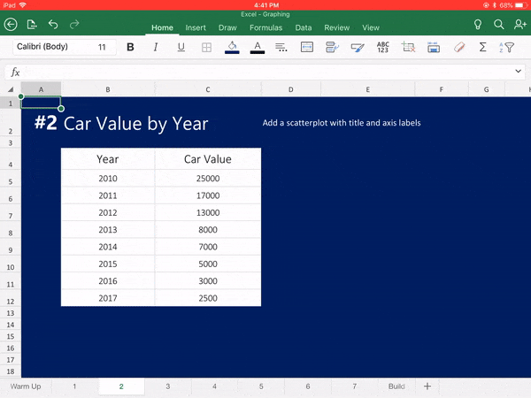
#3 - Roth IRAInsert a scatterplot for each set of data 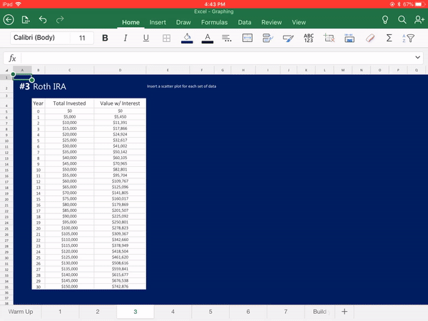
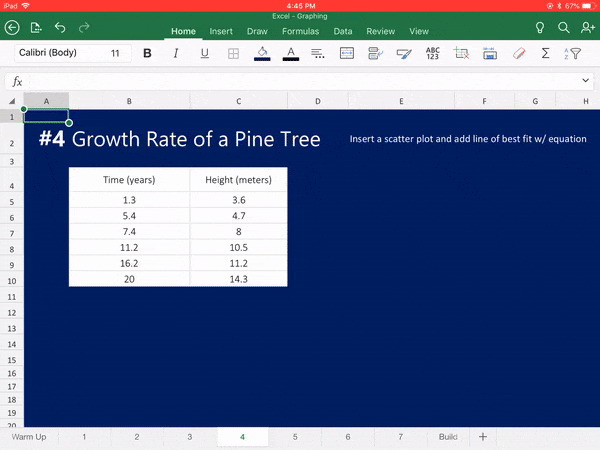
#4 - Growth Rate of a Pine TreeThe data provided tracks the height of a specific pine tree over time after it was purchased at a nursery. Plot the data and add a best fit line to answer the following questions:
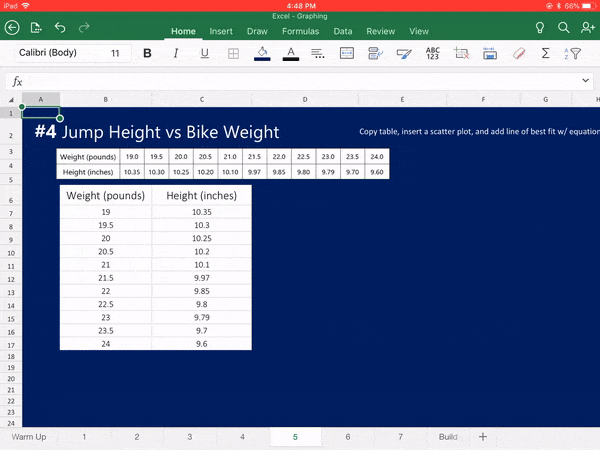
#5 - Jump Height vs Bike WeightIn BMX dirt-bike racing, jumping high or "getting air" depends on many factors: the rider's skill, the angle of the jump, and the weight of the bike. Here are data about the maximum jumping heights for various bike weights. Plot the data and add a best fit line to answer the following questions:
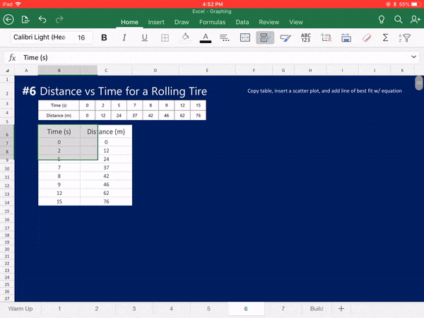
#6 - Distance vs Time for a Rolling TireA tire is rolled down a flat road. Data for the tires distance from the starting point was collected and placed into the following data table. Plot the data and add a best fit line to answer the following questions:
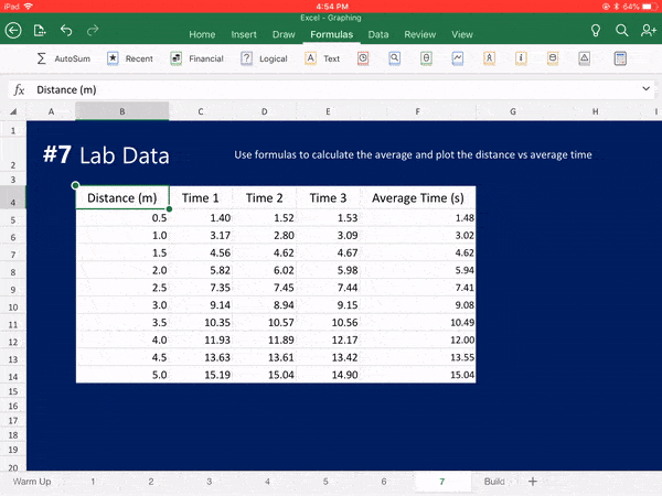
#7 - Lab DataYour lab group collects the time it takes a battery powered car to move in 0.5 meter increments. For each distance, you collect 3 trials worth of time information. Average these times and plot the distance vs average time and add a best fit line to answer the following questions. You will need to rearrange the columns on your table in order to create a graph with time on the x-axis and distance on the y-axis.
Files
Follow the links below to get details and materials for the rest of this 4-day unit on Excel Incorporating Excel on the iPadDay 1: Solving with FormulasDay 2: Graphing from DataDay 3: Graphing Data Collected from a LabDay 4: Excel Skills Assessment
Comments
|

Joe CossetteFather, Physics Teacher, Knowles Fellow, Friend, Techie, and Musician Blog Posts |
||||||||||||||||||||||||||||||||||||||||||||||||||||||
 RSS Feed
